- Details
- Written by: Ray Oltion
- Category: Painting
- Hits: 1393
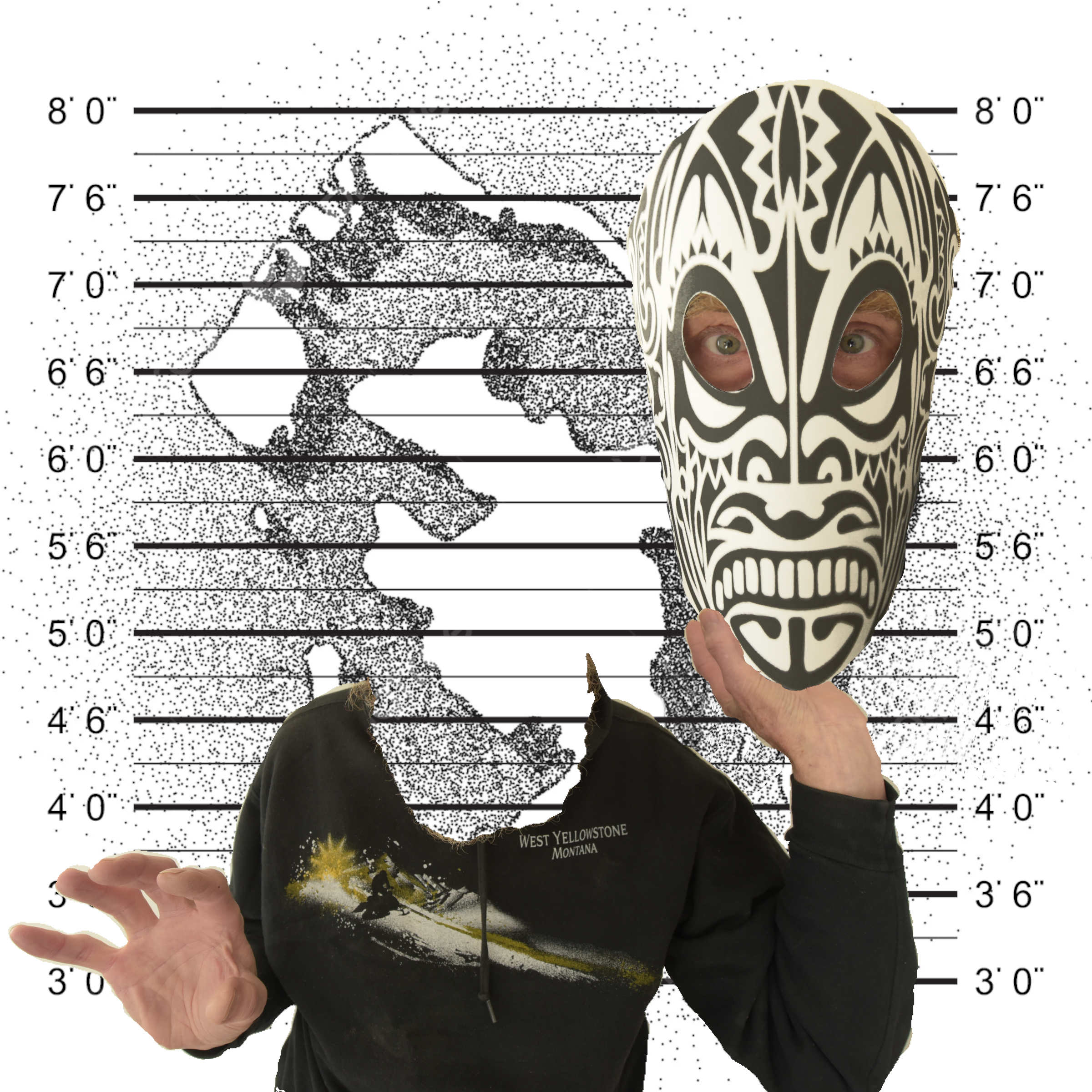
Did you know that Polynesian chiefs sometimes had their tattooed heads preserved? That must have been a way to remember and revere past leaders. Europeans became fascinated with these artifacts and tried to purchase them. To satisfy the demand, unscrupulous people, native or otherwise, tattooed the faces of slaves and then sold the heads to European collectors.
Quite a market, don't you think? Maybe some people would think that was better than killing rinoceros or elephants for horns and tusks, given how many humans there are on this planet compared to rinoceros and elephants. I do not approve of trophy hunting, human or animal, and do not condone slavery in any form for any purpose.
Anyway, here is my mask for the first week of the Abstract Painting class. I used a panoramic tattoo design, printed that out on 11x17 paper, cut out the eye holes, and trimmed the empty margins. Then I fashioned a clasp and positioned the mask on my face. Using my ultra-wide angle lens, I then photographed myself with the mask in place, and then without the mask, in a somewhat frightened pose.
In GIMP I cut out the useful components and inserted them into various layers so I could move them around. I used a police lineup grid for the background superimposed upon a stippled map of Bora Bora. Then I cut off my own head, in GIMP of course, and had my decapitated body hold the masked head. Maybe this is how the slaves' spirits felt.
- Details
- Written by: Ray Oltion
- Category: Painting
- Hits: 1683
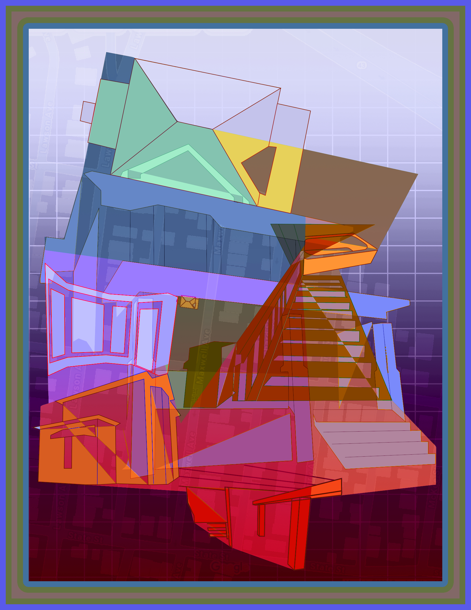
This image contains multiple perspectives of a property I was thinking about buying. It is a grand old brick two story home with living room, formal dining room, and ornate staircase going to the second floor.
Studying cubist painting techniques with Corey D'Augustine at MOMA https://youtu.be/rGZYfSzvPvs?si=2XTusVTBISP1txrq made me aware of using multiple perspectives of the same object / still life to construct a visual grid for a painting. This creates natural edges and shapes that become an abstract layer to the design.
I combined multiple photos of the property and scaled and moved GIMP paths around to link them together in a somewhat truthful way. For instance, the basement columns and beams are at the base of the image, the rear view to the left of that, and the stairway in the left center.
The frontal view dominates the overall form because it is larger and provides the scaffolding for everything else, such as the bay windows in the center left and the bathtub at the top of the stairs. The aerial view of the roof also sits above the eave of the roof on the frontal view.
I split the image into various geometric forms and applied a color bias to each one. This emphasized the planar nature of the design and extended some of the trends in the individual shapes. It also provided a local color temperature for each plane, in which color contrast could work to attract interest.
The background contains a square grid, suggesting a design layout sheet, and an overlay of the street map showing the house location. Maxwell Avenue is in the center of the map, running vertically, and the house footprint is shown in yellow with the brown outlines near the center of the picture.
- Details
- Written by: Ray Oltion
- Category: Painting
- Hits: 1588
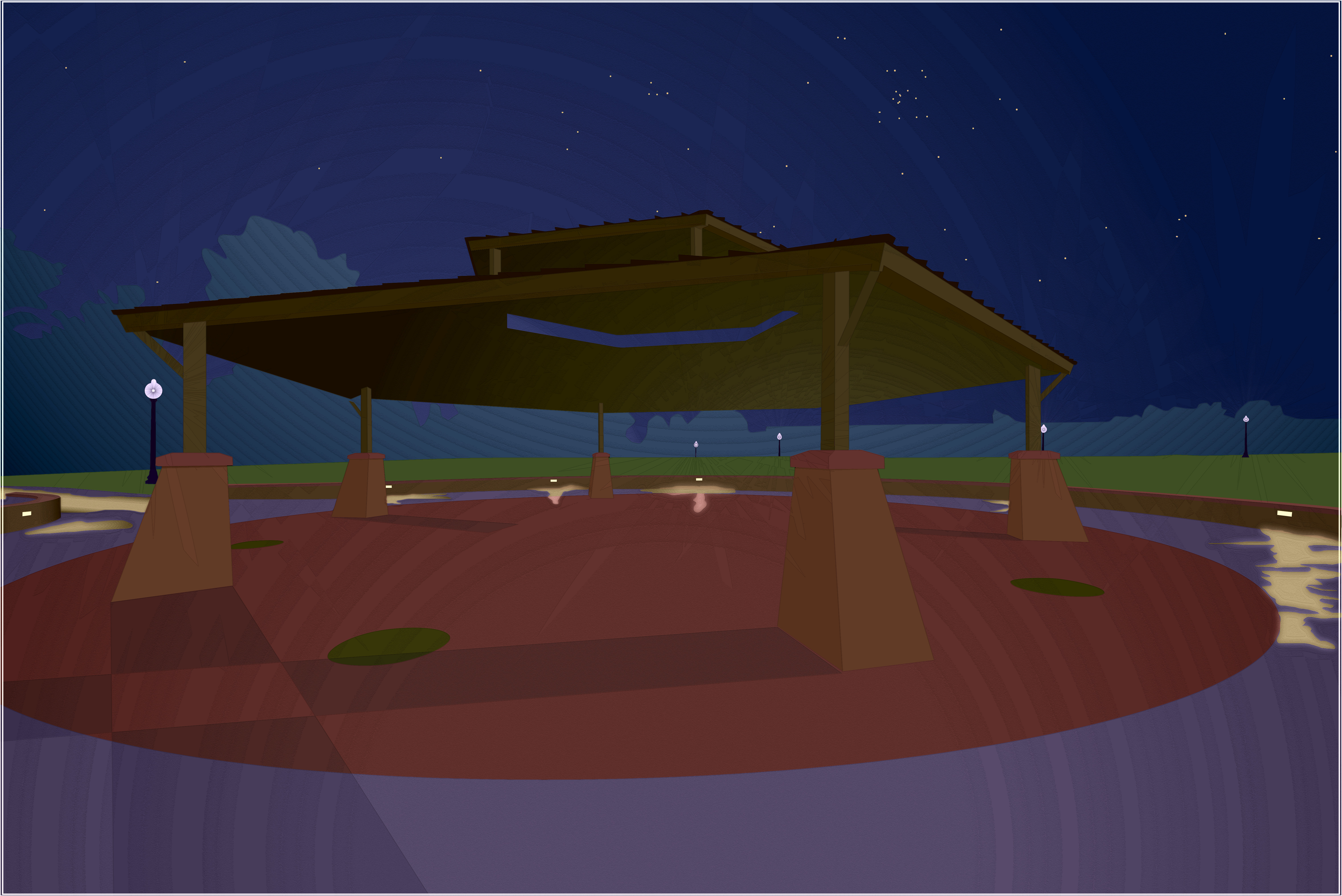
Several times this summer I went out early in the morning with my camera and super-wide angle lens. This is the pavilion at a park near where I live. The wide angle shot emphasizes the geometric shape of the pedestals and the roof. If the roof corners were turned up, it would resemble a Japanese pagoda. The picture was taken perhaps an hour before sunrise, when morning twilight was just appearing in the east.
My intent with this picture was to create a low-key rendition of the night scene with highlights from artificial lights. My time exposure also picked up stars, so I drew them in according to their actual positions. If you know your constellations, you can see the Hyades cluster in Taurus. It is the right pointing arrow with the group of stars in the middle, located above the pavilion roof edge that projects nearest to the viewer, in the upper right area of the sky.
The colors were pretty intense in the photograph even though it was night time, especially in the sky and the grass. I changed the colors in the trees and the pavement in the foreground to break up the separation of cool and warm in the upper and lower halves of the image. I also tried for some complimentary color contrasts, such as in the lavender / yellow and red / green adjacent shapes in the paved area.
The globe lights on the lampposts have a radial starburst emanating from each of them, but the effect is subtle. You can detect that starburst pattern in the pointed shapes radiating away from each globe. It shows in the grass and sky, as well as the columns and pedestals.
I used lots of radial gradients in the value scale, but then turned them into steps rather than smooth transitions. I then enhanced the edges of those steps with an embossing filter. Finally I applied a 4 level posterizing filter to exaggerate the stripes. The result pushes the image toward the abstract, which creates more dynamic energy in the forms.
Something like this would be fun to execute in glass, but it would be a nightmare to cut and fit the pieces. It could also be a candidate for sand etching on stained glass to get the curved overlay shapes. The digital version acts as a mock up for such an attempt.
- Details
- Written by: Ray Oltion
- Category: Painting
- Hits: 1508
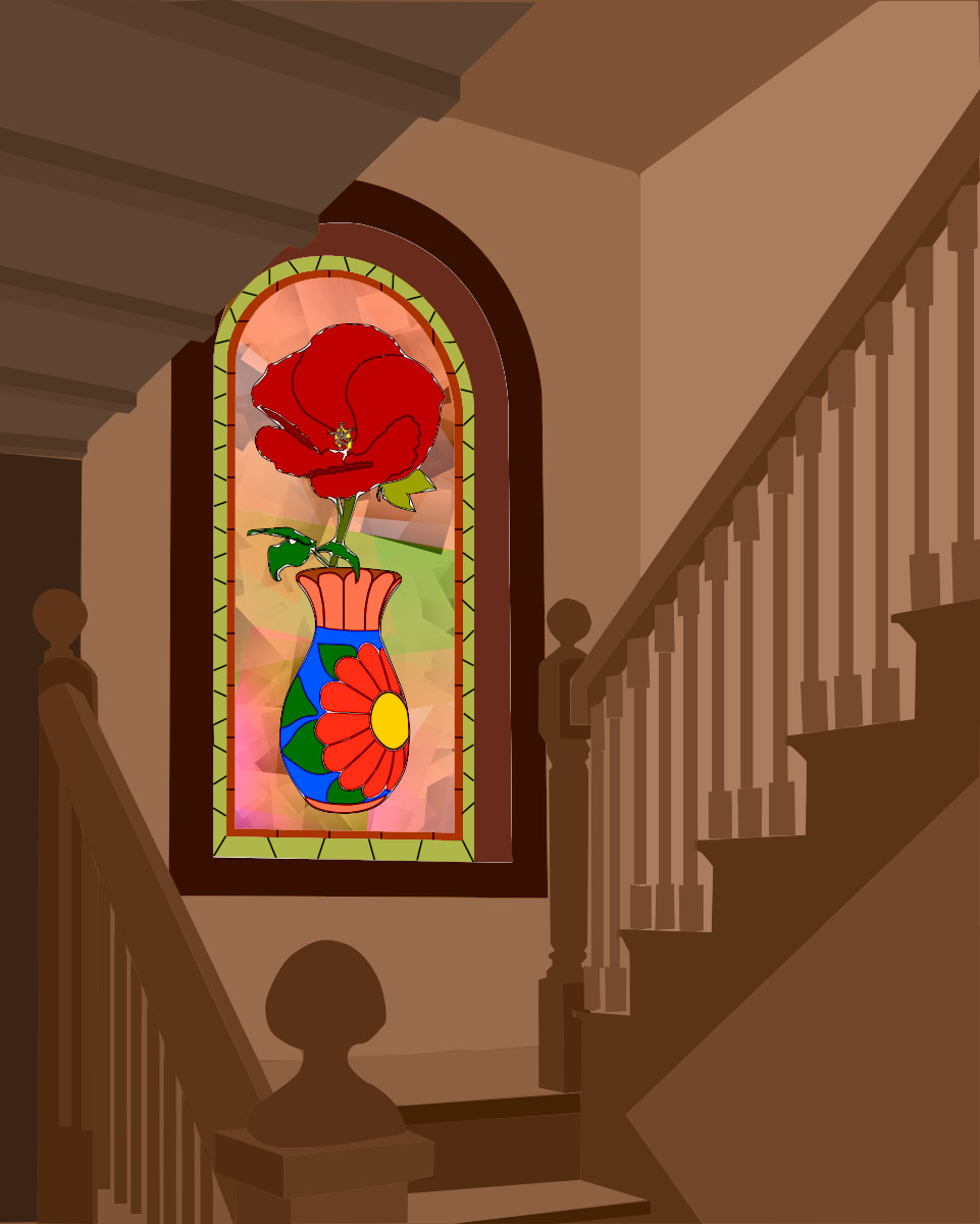
To make the main subject glow, I deliberately rendered everything else in monochrome and with lower intensity. The stained glass window is catching the afternoon light and is the main source of illumination.
Yes, perhaps I should show reflected color on the walls and steps, but keeping a monochrome contrast to the colors in the window was more important to me than trying for realism in the interior of the stairwell.
The window frame is darker and slightly more intense than the walls to provide strong contrast with the stained glass window. The stair banisters and treads direct the eye towards the window. The ceiling on the upper left intersects the window frame to provide a depth cue.
The flower is a red hibiscus and the vase is a brightly painted Mexican pot. The abstract background behind the vase and pot would be painted on the stained glass, since there are no lead lines.
If this were ever realized in stained glass, the background would probably have to be broken up with shapes that could be easily cut with the associated lead lines. This would anchor the vase to the ground and perhaps indicate background forms behind the flower.
The flower and vase show lead lines, as do the red and green border strips. It could be fun to play more with the lead lines, making them vary in thickness, especially where the form suggests a wider line.
The white highlights around the flower and leaves are a happy accident, due to outlines not quite matching up. I decided they added something subtle to the window, so I left them in.
- Details
- Written by: Ray Oltion
- Category: Painting
- Hits: 1484
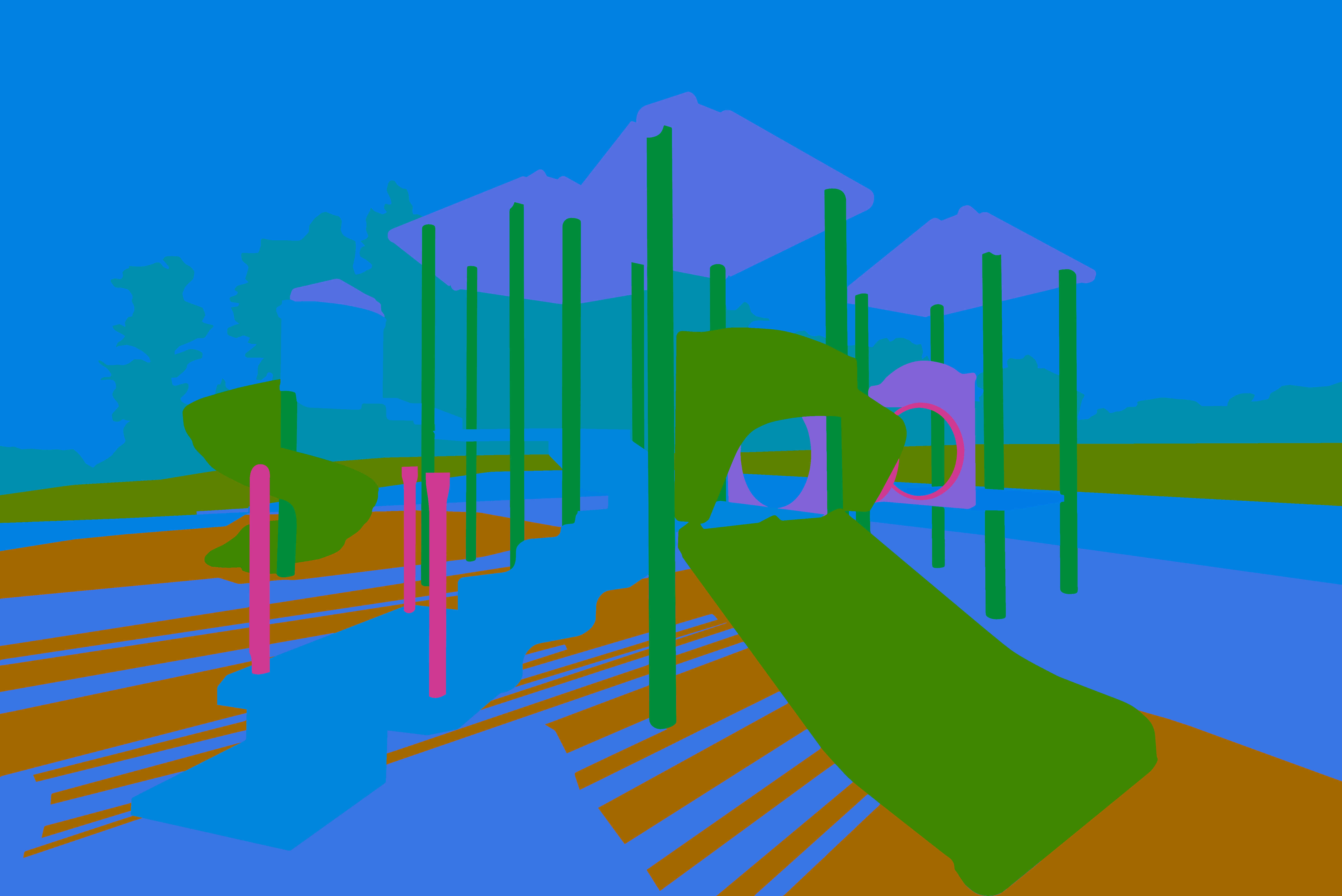
This is a color study of playground equipment. It uses the method of Sergei Bongart, which starts with large block-shapes and relatively no detail. For example, I left out the many railings and the mesh in the tunnel to the right. The goal is to decide upon the color relationships before dealing with other picture elements, such as value and saturation. Here is a full description of his method: https://www.keenewilson.com/page/1358/sergei-bongart-on-art-and-painting
I find this valuable in that it makes hue the only variable, while both the value and saturation are held constant. This puts the focus on the different hues and how they change each other by their combined effect. It also reveals the vibration between different hues. Some of the hues were inspired by local color, but I found myself diverging from that in several cases to create more contrast and tension. Of course, not all the colors will be this saturated and there will be a range of values in the finished painting.
Sergei Bongart's paintings intrigue me and he has a different approach to color design, one that seems efficient and pure. It also lends itself well to my digital methods, since I can change the values and saturation easily in separate layers, leaving the hues alone once the color design is fixed. He stated that most of the time in a painting should be spent at this stage, and that is my experience.
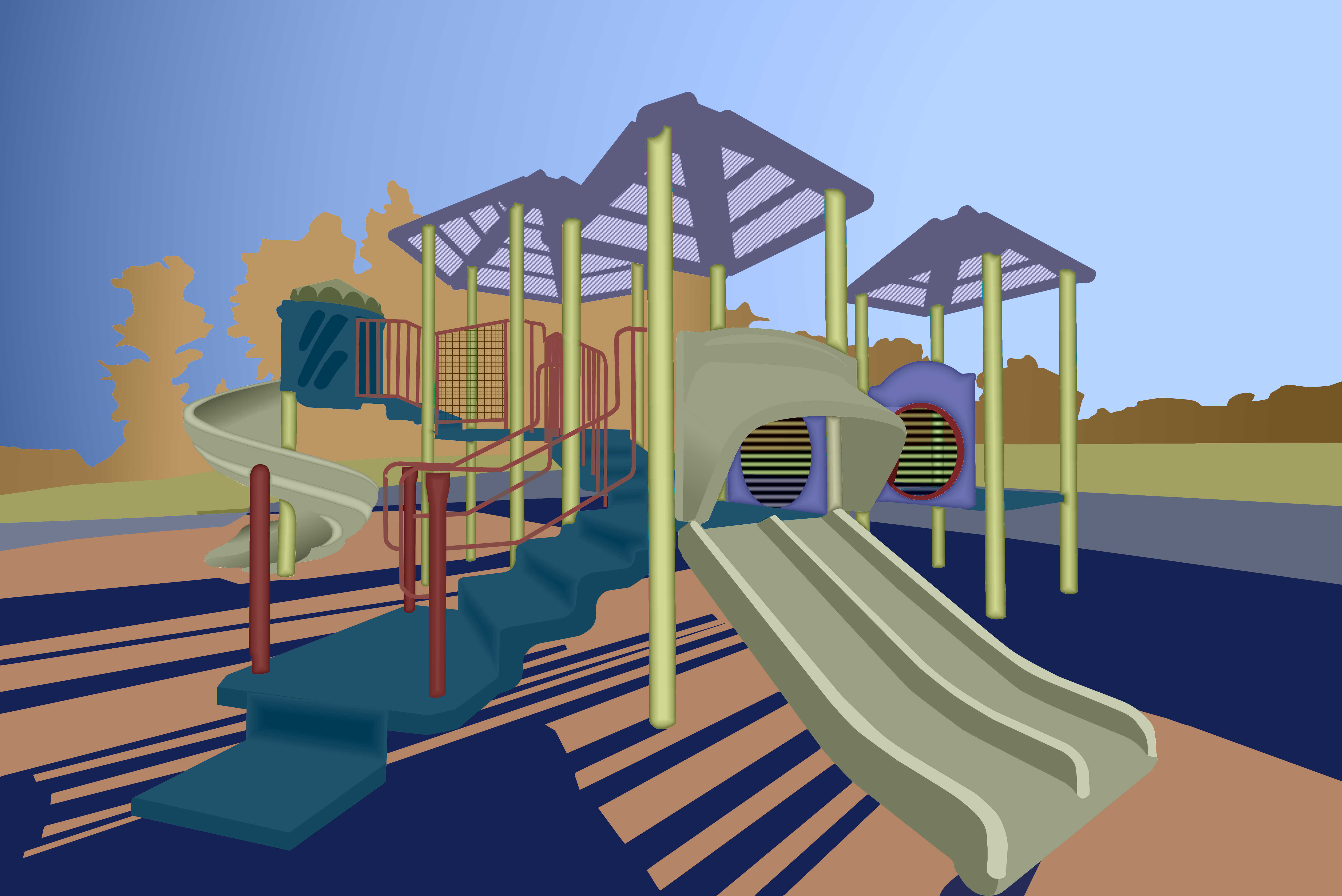 This is the final painting of the playground equipment. It has approximately the same colors as last week, but I changed them somewhat to match the gamut for a split compliment color scheme. I also made the trees golden to suggest fall, which describes the season outside now. The next slide shows the color gamut with the allowed hues.
I added more detail to break up the block shapes and provide a more inviting visual play for the viewer. My hope is that your eye will traverse the structure as a five year-old would explore the actual structure.
I deliberately left the sky and trees flat with no detail because I wanted the irregular edge of the tree tops to define the boundary between those two shapes. That provides a negative / positive interaction in the background.
The red pipe guardrails may be too busy, but without them the stairs seemed to float in space. This way they funnel the eye up to the pod above the spiral slide.
Another subtle eye path is the tunnel between the two elliptical openings on the mid-right. The red sickle shape helps drag the eye through that space. I made the background showing through the tunnel mesh darker and slightly bluer to suggest a somewhat confined tube.
I tried adding texture to some of the picture elements, but wound up liking the flat planes better. They are obviously abstractions and not trying to be too realistic. The roof panels have perforations, which makes those areas lighter.
The intensity or chroma is fairly modest, but any lower and the painting started to look drab. Maybe my eye was already conditioned to more saturation and I should have kept dialing it down. What do you think?
The shadows on the playground mat may compete with the play structure for your attention, but I wanted them to be very strong to suggest late afternoon light. The columns could have their highlights facing more toward the right where the Sun was, but I got lazy and used a default shaped gradient for all the columns at one time. Maybe the shadows are convincing enough without the more accurate modeling.
Sergei Bongart warns against getting too fussy with detail, and I might have transgressed that boundary. I wanted this to be a visual playground, though, so I had to keep pushing it towards realism until it firmly established itself. Someone with more experience might have been able to get the same effect with a much more abstract and schematic presentation.
Subcategories
Abstract Painting
These images are less representational and more non-objective.