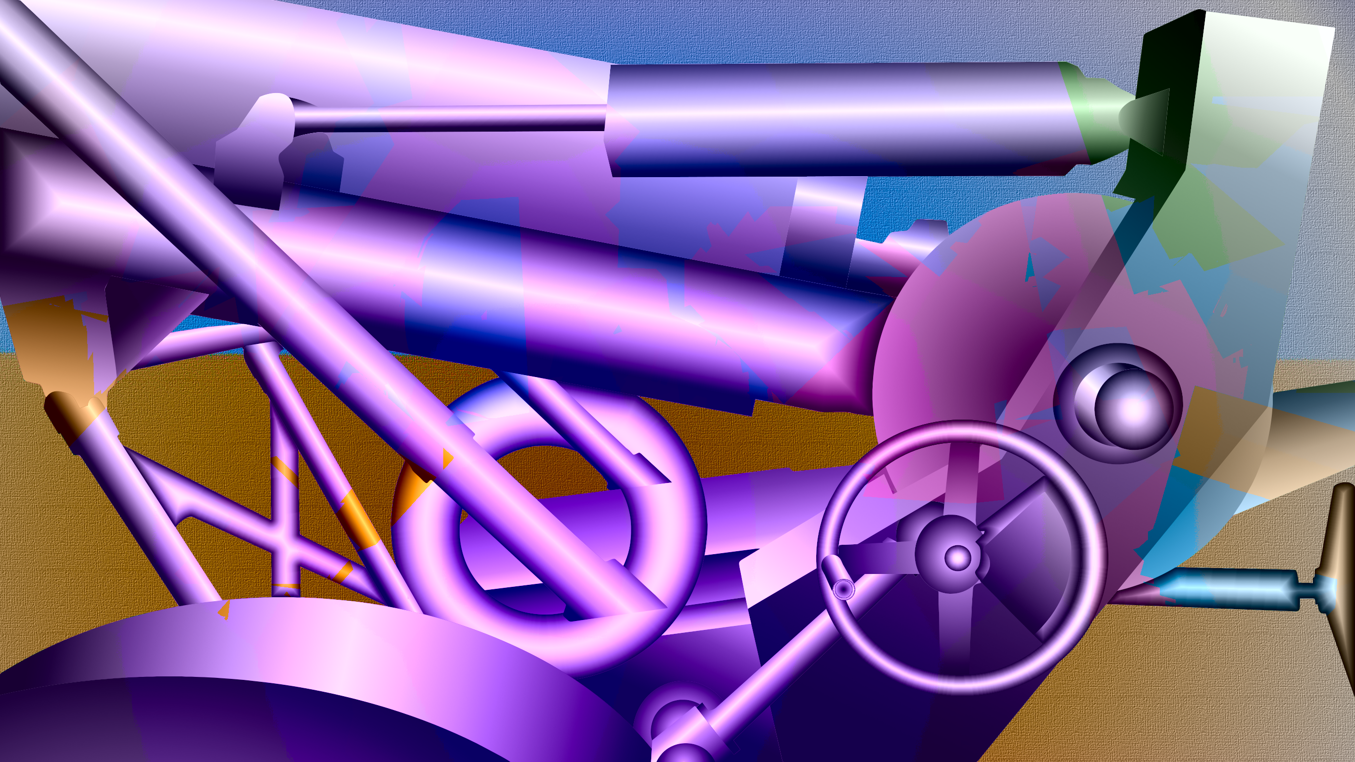
As the title suggests, this is an antique cannon from the National Guard compound. The various cylinders and wheels fascinated me, and that became the focus of my composition. You might call this semi-abstract, since some of the forms don't exactly follow rules of overlapping shapes. For instance, the doughnut shape in the center of the image should have been partially obscured by the gun chassis, but it was so strong with the connecting diagonal struts that it had to remain in full view.
As you can see, the image makes extensive use of bilateral gradients, which creates a highlight line on a cylindrical object. The torus forms also use a cylindrical type of shading to give them the illusion of a convex cross-section. The forms suggest a polished surface in diffused light, although they depart from reality somewhat, since the ones underneath the gun barrel should be in shadow.
Since this exercise examined transparency in hues, my choices were to either deliberately merge background and foreground with overlaps, or to preserve the solidity of the shapes and apply surface effects to suggest painted shapes on the cannon. Since this image leaned more towards the representative mode, and since the original cannon has camouflage paint, the latter choice made more sense.
Of course the colors reflect my aesthetic choices and were not intrinsic to the object. The object has a violet to green gradient, and the background a yellow to blue gradient. The object also has jagged linear boundaries in hue that simulate cut pieces of colored paper randomly distributed, or even pasted upon the form, sort of like decoupage. The background is relatively simple, but employs a canvas like texture, which reinforces the message that this is a two dimensional representation in a picture frame.
If you look closely you may notice some background colors splattered on the object. This might suggest the mud and grime associated with battle and the violence of exploding shells. No, there are no red splotches, as that might be a little melodramatic.
The colors may be too intense, but this image packed more visual energy than several other candidates with lower chromatic range. While the other less intense versions soothed the eye, that seemed incongruous with the inherent power and violence in a weapon. Perhaps the dominant violet hue represents the use of war by royalty and governments to protect their interests and expand their empires. Maybe you could say there is a sort of sinister beauty in such objects.
The colors may be too intense, but this image packed more visual energy than several other candidates with lower chromatic range. While the other less intense versions soothed the eye, that seemed incongruous with the inherent power and violence in a weapon. Perhaps the dominant violet hue represents the use of war by royalty and governments to protect their interests and expand their empires. Maybe you could say there is a sort of sinister beauty in such objects.