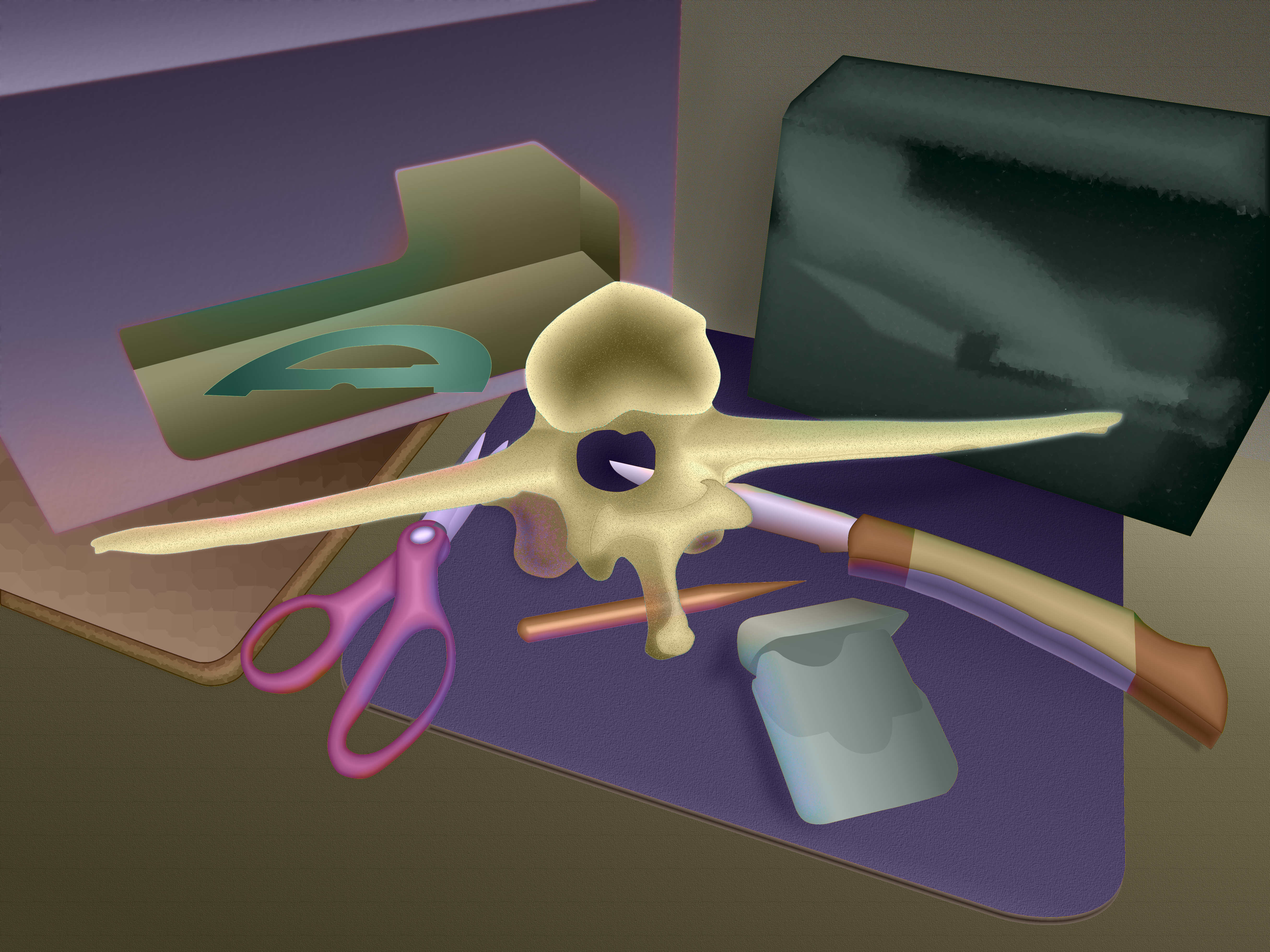
I composed this still life with part of the backbone to one of my goats, along with various boxes, cutting tools, mouse pad, ceramic tile, pencil, and even a dental floss container. The setup was on a countertop, but I elected to leave that and the background relatively blank. I know the still life floats as a result, but in a way I want to challenge the illusion with the raw canvas in the foreground. The background does possess some solidity, as evidenced from the shadow of the box on the right, between the two boxes.
This picture uses a split compliment color scheme, with orange and violet opposite red and green. This could easily get out of control, so the color saturation is relatively low.
My goal was to gain more control over value and color saturation to provide the right amount of emphasis on the main subject elements. I also wanted to show colors in shadows and reflections. In some cases I had to increase the color saturation in those areas to allow the reflected colors to show.
The exception is in the greenish-black box on the right. It has a shiny surface, so reflects light readily, but it is so black that it knocks out all color intensity. That is why the reflections in the box are greenish-grey tones only and possess no local color.
It was fun guessing where reflected colors would appear on the objects. My photo of the setup wasn't very good, and I didn't have the original objects available, so I had to invent everything from my imagination.
I tried to be subtle with the reflected light, so you might have to magnify the image and inspect the edges of the forms to see the individual colors. Maybe the overall effect comes through and the picture looks somewhat natural.
This departs from my previous work, which didn't attempt realism. Now I understand why this appeals to some artists. You feel like some sort of creator, making worlds out of the void.
In response to a question about my process, I can offer the following. I will try to answer them in non-technical language, since you might want to use PhotoShop and it might differ from GIMP:
I used to use layers for outlines that I drew from the objects in the photograph, but that was error-prone and messy. There were always overlaps and holes between shapes, and the thickness of the lines sometimes interfered with the flow from one shape to another.
My technique evolved to using paths, which are mathematical descriptions of a closed loop consisting of points and curves. These exist not in a layer but in their own list. You can name them and edit them if you like.
The paths can intersect and overlap, such as the knife blade being behind the vertibra and reappearing in the hole for the spinal column. You can use the paths as selection tools, and logically add, subtract, or intersect them. This eliminates problems with trying to draw lines and color within them.
Once I select the area I want, I can fill it with either grey tones for the value, colors for the hue, or different intensities of one color for the saturation. These elements each have their own layer, for Luminance, Chroma, and Hue, or LCH as this scheme is named. This gives me control over each element independently.
If I want to emphasize the edge, I can stroke the path with a colored or patterned line of any width I desire. I actually did that on the vetribra. If you zoom in on that image you may see numerous small green dots on the edge surrounding the shape. This might create a subtle vibration with the surrounding areas.