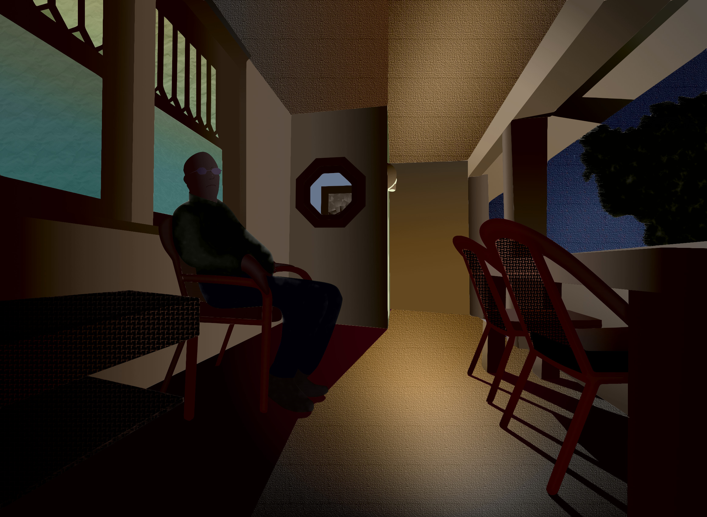
This picture shows my neighbor Steve on his porch during an early fall evening, and is actually Version 2. My first attempt, Version 1, is below for you to compare. Please spend some time contemplating the above picture first before comparing it to the picture below.
The extreme wide angle of view accentuates a sense of depth and space on an otherwise narrow and shallow room by providing a strong sense of perspective. Some of the shapes are distorted, especially in the table and bench that abut the left and right borders, but the verticals are pretty straight, as the line of sight is essentially level.
The light in the sky is a deep blue and the tree shows some color from the light from street lamps. Most of the light in the picture comes from the porch light above the entry door, which is towards the left center. The porch steps are on the right behind the chairs and are not visible. The other source of light comes from the windows behind Steve, and through the octagonal window in the entryway.
The shadows of the chair legs and the entryway wall on the floor provide evidence of the dominant light source, as well as the shadow on the ceiling from the entryway wall and the column shadow on the porch overhang. This shadow has a green hue due to reflected light from the lawn, and perhaps some blue light from the evening sky mixing with the yellow paint on the overhang. Since Steve was mostly in shadow, his body doesn't cast a shadow, although in reality their may have been a slightly deeper part of shadow from his body on the wall behind him. His legs change the line of shadow on the floor.
The colors attempt to represent artificial light with a warm tone, possibly from the quality of the light source, but also from the yellow color of the porch paint, although in reality the floor had a grey paint that picked up some of the direct and reflected light from the walls and ceiling. This gave it a yellow cast even though the surface was more neutral.
The color scheme may be split complementary, as the green from the upper window, Steve's shirt, the tree, and a sliver of light on the entryway behind the porch light contrasts with the red of the chairs and the wicker bench. The magenta in the shadows on the floor compliment the yellow walls, floor, and columns. The blue in the windows, sky, and Steve's trousers may be analogous to the yellow and green, but there doesn't appear to be a corresponding orange in the picture, except maybe the side of the wicker bench.
The forms overlapped and required me to draw through the top ones to convincingly depict the underlying shapes. The table goes though the chairs on the right, and the columns pass through the chairs and table. Steve's body outline passes through the chair he sits upon. Likewise, the window passes through his body, and the wall and floor line passes through the wicker bench on the left.
I played with a woven texture on the chair backs and wicker bench. The chair backs show some transparency, allowing the background columns, chair cushions, and table legs to peep through. This intrigues me and I might search for more subjects that allow this dimension to the design. The canvas texture on the sky, ceiling, and floor breaks up these large featureless areas, although it may be overdone and unbalanced, weighting the picture towards the right. The strong pattern on the wicker bench on the left might offset that effect somewhat, though.
This strong texture might compete with the focal point, which logically should be Steve. Then again, maybe Steve is just one of the forms on his porch, and the overall environment is the subject of the picture. After all, it was the feeling of sitting on the porch with an agreeable companion during a pleasant evening that remains in my memory, and recreating this was my objective.
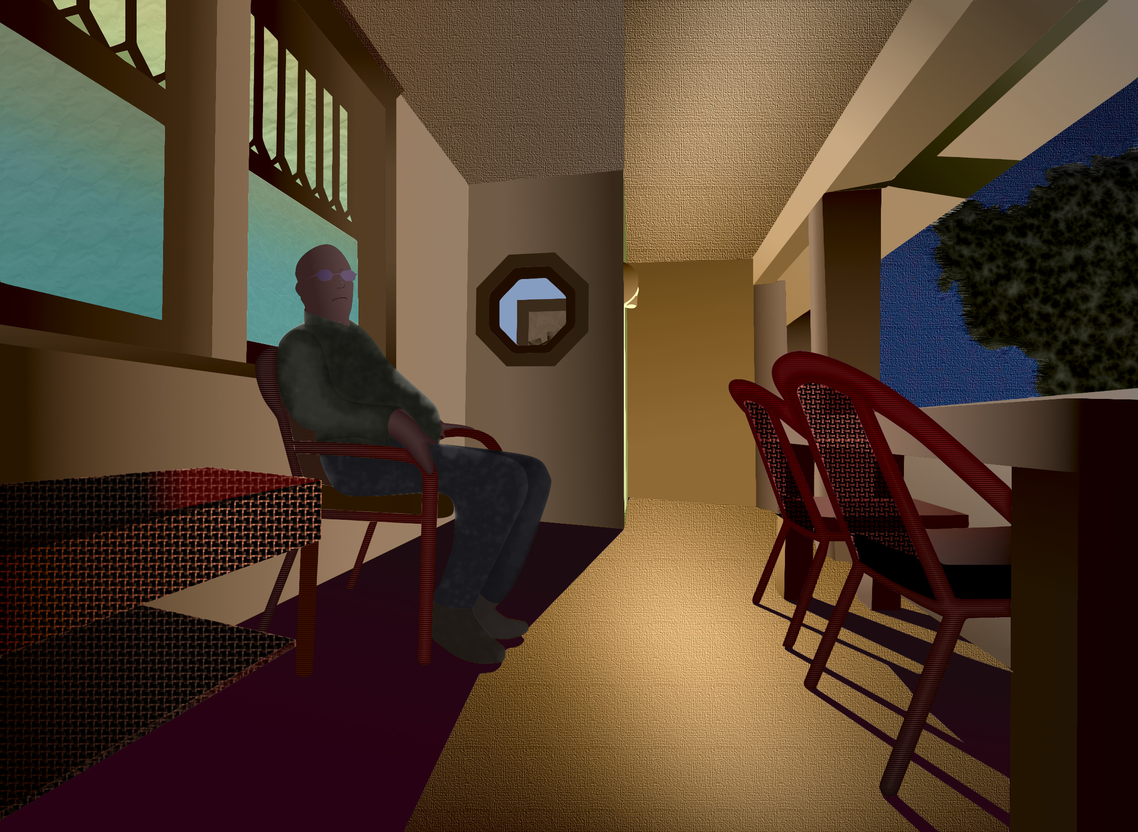
This is my first attempt, where the colors are possibly too intense, except for Steve's shirt and trousers, which are possibly too neutral. I experimented with reducing the overall intensity but liked this version better. In retrospect, per Mark Carder's advice, the colors may be over-saturated and the values too high.
This may be due to mental bias from starting with a high key value study in the lightness layer and fully saturated colors in the hue layer and then trying to reduce the intensity in the chroma layer.
Maybe I should change my approach and start with low saturation and low key first, and carefully increase the intensity and value only when it seems absolutely necessary, such as for dominant forms and highlights. Starting with highly saturated colors and high key values may poison my sense of balance and make more realistic renditions seem bland and moody.
Switch between my second version and this one to see the difference. After looking at this more intense version, does the second version above look drab? When you first looked at the second version, before looking at this one, did it seem about right?
Mark Carder maintains that once you see the intense and over-exposed version, the more reserved version loses its appeal. That's the trap, and most people fall into it without noticing. This says you have to be very careful with saturation and exposure / key values. It is easy to overdo it, and you won't even realize you have done so until it is too late.