- Details
- Written by: Ray Oltion
- Category: Painting
- Hits: 1400
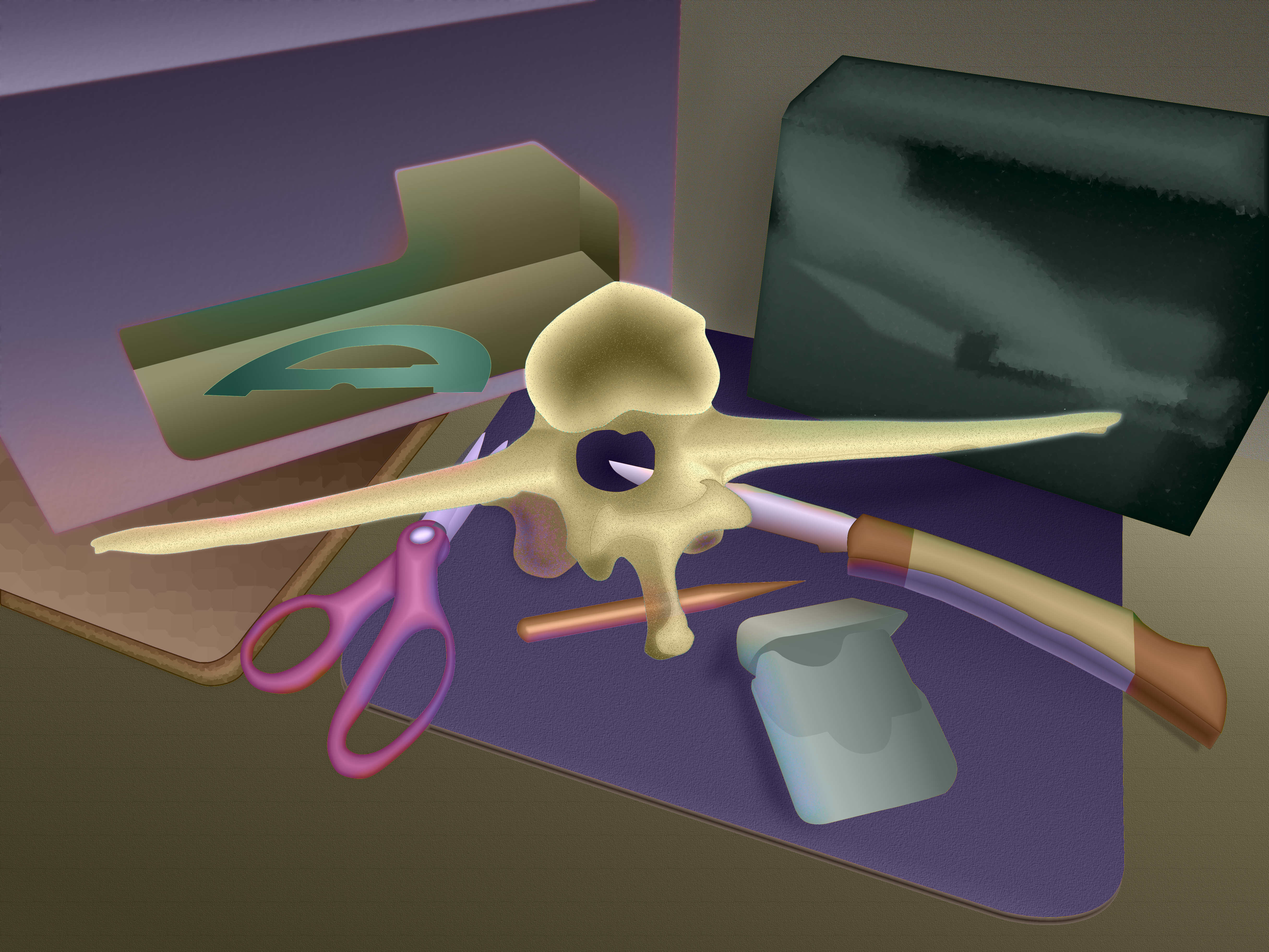
I composed this still life with part of the backbone to one of my goats, along with various boxes, cutting tools, mouse pad, ceramic tile, pencil, and even a dental floss container. The setup was on a countertop, but I elected to leave that and the background relatively blank. I know the still life floats as a result, but in a way I want to challenge the illusion with the raw canvas in the foreground. The background does possess some solidity, as evidenced from the shadow of the box on the right, between the two boxes.
This picture uses a split compliment color scheme, with orange and violet opposite red and green. This could easily get out of control, so the color saturation is relatively low.
My goal was to gain more control over value and color saturation to provide the right amount of emphasis on the main subject elements. I also wanted to show colors in shadows and reflections. In some cases I had to increase the color saturation in those areas to allow the reflected colors to show.
The exception is in the greenish-black box on the right. It has a shiny surface, so reflects light readily, but it is so black that it knocks out all color intensity. That is why the reflections in the box are greenish-grey tones only and possess no local color.
It was fun guessing where reflected colors would appear on the objects. My photo of the setup wasn't very good, and I didn't have the original objects available, so I had to invent everything from my imagination.
I tried to be subtle with the reflected light, so you might have to magnify the image and inspect the edges of the forms to see the individual colors. Maybe the overall effect comes through and the picture looks somewhat natural.
This departs from my previous work, which didn't attempt realism. Now I understand why this appeals to some artists. You feel like some sort of creator, making worlds out of the void.
In response to a question about my process, I can offer the following. I will try to answer them in non-technical language, since you might want to use PhotoShop and it might differ from GIMP:
I used to use layers for outlines that I drew from the objects in the photograph, but that was error-prone and messy. There were always overlaps and holes between shapes, and the thickness of the lines sometimes interfered with the flow from one shape to another.
My technique evolved to using paths, which are mathematical descriptions of a closed loop consisting of points and curves. These exist not in a layer but in their own list. You can name them and edit them if you like.
The paths can intersect and overlap, such as the knife blade being behind the vertibra and reappearing in the hole for the spinal column. You can use the paths as selection tools, and logically add, subtract, or intersect them. This eliminates problems with trying to draw lines and color within them.
Once I select the area I want, I can fill it with either grey tones for the value, colors for the hue, or different intensities of one color for the saturation. These elements each have their own layer, for Luminance, Chroma, and Hue, or LCH as this scheme is named. This gives me control over each element independently.
If I want to emphasize the edge, I can stroke the path with a colored or patterned line of any width I desire. I actually did that on the vetribra. If you zoom in on that image you may see numerous small green dots on the edge surrounding the shape. This might create a subtle vibration with the surrounding areas.
- Details
- Written by: Ray Oltion
- Category: Painting
- Hits: 1468
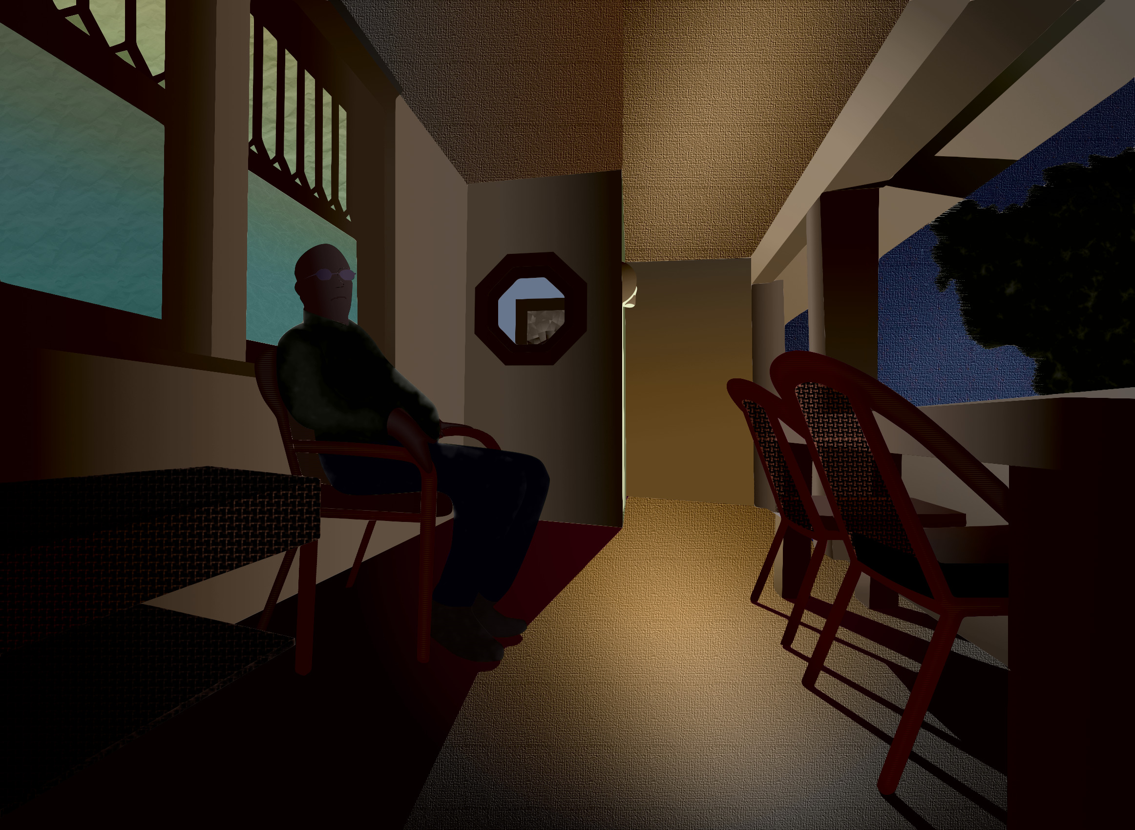
This picture shows my neighbor Steve on his porch during an early fall evening, and is actually Version 2. My first attempt, Version 1, is below for you to compare. Please spend some time contemplating the above picture first before comparing it to the picture below.
The extreme wide angle of view accentuates a sense of depth and space on an otherwise narrow and shallow room by providing a strong sense of perspective. Some of the shapes are distorted, especially in the table and bench that abut the left and right borders, but the verticals are pretty straight, as the line of sight is essentially level.
The light in the sky is a deep blue and the tree shows some color from the light from street lamps. Most of the light in the picture comes from the porch light above the entry door, which is towards the left center. The porch steps are on the right behind the chairs and are not visible. The other source of light comes from the windows behind Steve, and through the octagonal window in the entryway.
The shadows of the chair legs and the entryway wall on the floor provide evidence of the dominant light source, as well as the shadow on the ceiling from the entryway wall and the column shadow on the porch overhang. This shadow has a green hue due to reflected light from the lawn, and perhaps some blue light from the evening sky mixing with the yellow paint on the overhang. Since Steve was mostly in shadow, his body doesn't cast a shadow, although in reality their may have been a slightly deeper part of shadow from his body on the wall behind him. His legs change the line of shadow on the floor.
The colors attempt to represent artificial light with a warm tone, possibly from the quality of the light source, but also from the yellow color of the porch paint, although in reality the floor had a grey paint that picked up some of the direct and reflected light from the walls and ceiling. This gave it a yellow cast even though the surface was more neutral.
The color scheme may be split complementary, as the green from the upper window, Steve's shirt, the tree, and a sliver of light on the entryway behind the porch light contrasts with the red of the chairs and the wicker bench. The magenta in the shadows on the floor compliment the yellow walls, floor, and columns. The blue in the windows, sky, and Steve's trousers may be analogous to the yellow and green, but there doesn't appear to be a corresponding orange in the picture, except maybe the side of the wicker bench.
The forms overlapped and required me to draw through the top ones to convincingly depict the underlying shapes. The table goes though the chairs on the right, and the columns pass through the chairs and table. Steve's body outline passes through the chair he sits upon. Likewise, the window passes through his body, and the wall and floor line passes through the wicker bench on the left.
I played with a woven texture on the chair backs and wicker bench. The chair backs show some transparency, allowing the background columns, chair cushions, and table legs to peep through. This intrigues me and I might search for more subjects that allow this dimension to the design. The canvas texture on the sky, ceiling, and floor breaks up these large featureless areas, although it may be overdone and unbalanced, weighting the picture towards the right. The strong pattern on the wicker bench on the left might offset that effect somewhat, though.
This strong texture might compete with the focal point, which logically should be Steve. Then again, maybe Steve is just one of the forms on his porch, and the overall environment is the subject of the picture. After all, it was the feeling of sitting on the porch with an agreeable companion during a pleasant evening that remains in my memory, and recreating this was my objective.
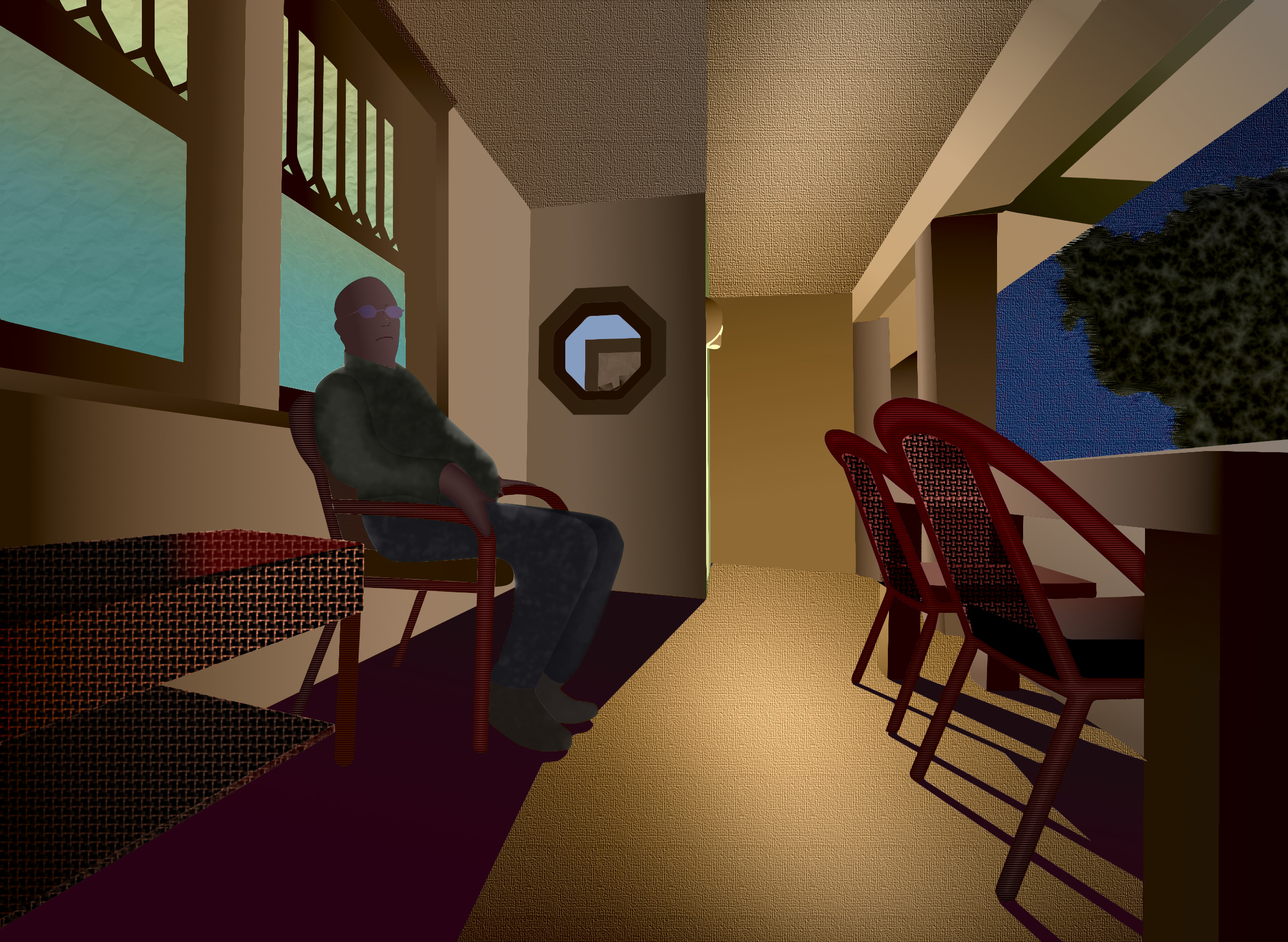
This is my first attempt, where the colors are possibly too intense, except for Steve's shirt and trousers, which are possibly too neutral. I experimented with reducing the overall intensity but liked this version better. In retrospect, per Mark Carder's advice, the colors may be over-saturated and the values too high.
This may be due to mental bias from starting with a high key value study in the lightness layer and fully saturated colors in the hue layer and then trying to reduce the intensity in the chroma layer.
Maybe I should change my approach and start with low saturation and low key first, and carefully increase the intensity and value only when it seems absolutely necessary, such as for dominant forms and highlights. Starting with highly saturated colors and high key values may poison my sense of balance and make more realistic renditions seem bland and moody.
Switch between my second version and this one to see the difference. After looking at this more intense version, does the second version above look drab? When you first looked at the second version, before looking at this one, did it seem about right?
Mark Carder maintains that once you see the intense and over-exposed version, the more reserved version loses its appeal. That's the trap, and most people fall into it without noticing. This says you have to be very careful with saturation and exposure / key values. It is easy to overdo it, and you won't even realize you have done so until it is too late.
- Details
- Written by: Ray Oltion
- Category: Painting
- Hits: 1458
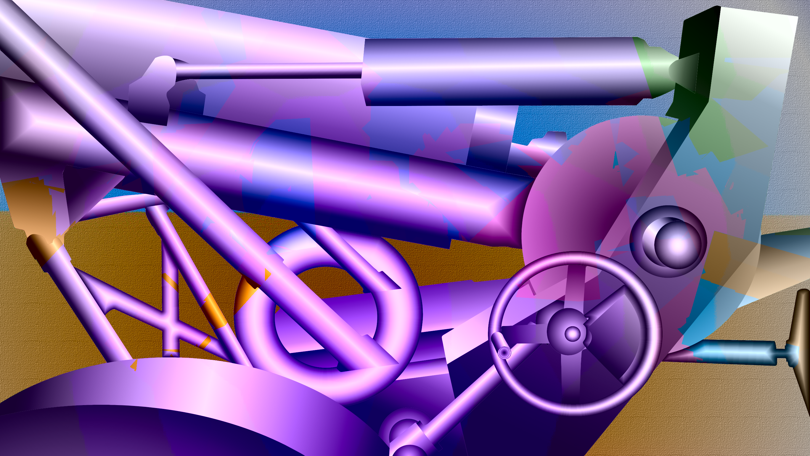
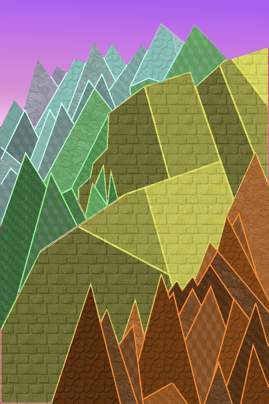
As you can see, the image makes extensive use of bilateral gradients, which creates a highlight line on a cylindrical object. The torus forms also use a cylindrical type of shading to give them the illusion of a convex cross-section. The forms suggest a polished surface in diffused light, although they depart from reality somewhat, since the ones underneath the gun barrel should be in shadow.
Since this exercise examined transparency in hues, my choices were to either deliberately merge background and foreground with overlaps, or to preserve the solidity of the shapes and apply surface effects to suggest painted shapes on the cannon. Since this image leaned more towards the representative mode, and since the original cannon has camouflage paint, the latter choice made more sense.
Of course the colors reflect my aesthetic choices and were not intrinsic to the object. The object has a violet to green gradient, and the background a yellow to blue gradient. The object also has jagged linear boundaries in hue that simulate cut pieces of colored paper randomly distributed, or even pasted upon the form, sort of like decoupage. The background is relatively simple, but employs a canvas like texture, which reinforces the message that this is a two dimensional representation in a picture frame.
The colors may be too intense, but this image packed more visual energy than several other candidates with lower chromatic range. While the other less intense versions soothed the eye, that seemed incongruous with the inherent power and violence in a weapon. Perhaps the dominant violet hue represents the use of war by royalty and governments to protect their interests and expand their empires. Maybe you could say there is a sort of sinister beauty in such objects.
- Details
- Written by: Ray Oltion
- Category: Painting
- Hits: 1489
- Details
- Written by: Ray Oltion
- Category: Painting
- Hits: 1653
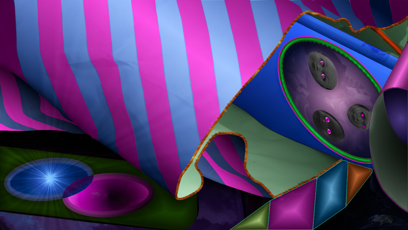
I intended to evoke a party atmosphere with the discarded trimmings and give them a somewhat sinister feel with the magenta eyes in the doll faces. Those attract the most attention due to our innate facial recognition gestalt capabilities. Also, the upright panels leading from the middle foreground to the box at middle right direct the eye into that area. They look like jewels with the faceted light and belt-like attachment.
The starburst in the lower left corner sits next to and overlaps an elliptical sink, with a darkening center. The magenta ellipse sucks the light from the blue-white radiant source to its left. This resembles a black hole next to a supernova. The green tablet on which they rest may be our flat platform on Earth for observing such cosmic wonders. It floats in an ethereal sky filled with dimly lit clouds.
This design element sets up tension within itself via the starburst / sink ellipses. It also pulls the viewer's eye away from the dolls' eyes. The radiating lines of light from the starburst propel the eye back into the design of the bag. This also creates a mysterious inversion of up and down, as if we are seeing through the Earth to the Universe that exists all around us.
The three negative spaces moving diagonally from middle left to lower right represent the void before time and space came into being. They may also represent the nothingness from which we sprang and which awaits us after death, if you don't believe in creation and heaven.
The textured orange cord on the edge of the bag emphasizes that shape, which may be the most interesting abstract form with its tight loop in the center foreground. The bag handle and orange jewel also frame the center of interest in the box with the elliptical medallion.
Inside the medallion the low chroma / intensity emphasizes the glaring magenta eyes of the dolls. The deliberate zero chroma / intensity of the faces also challenges our preoccupation with skin color. The top doll is looking at the one to her left, while the one on the bottom stares straight at the viewer. The third doll on the far right casts a mind spell on us and you can see the emanating thought waves.
Subcategories
Abstract Painting
These images are less representational and more non-objective.