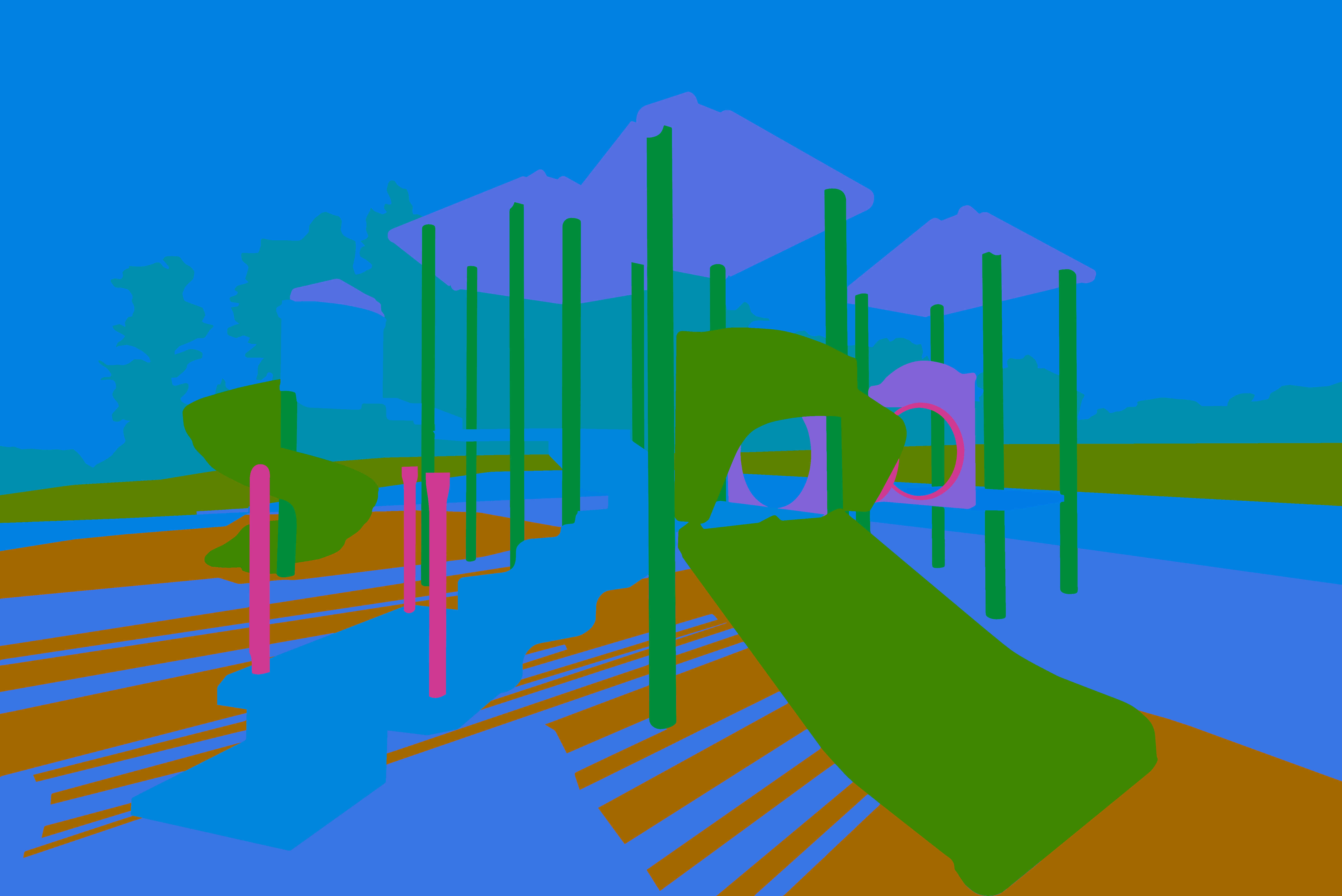
This is a color study of playground equipment. It uses the method of Sergei Bongart, which starts with large block-shapes and relatively no detail. For example, I left out the many railings and the mesh in the tunnel to the right. The goal is to decide upon the color relationships before dealing with other picture elements, such as value and saturation. Here is a full description of his method: https://www.keenewilson.com/page/1358/sergei-bongart-on-art-and-painting
I find this valuable in that it makes hue the only variable, while both the value and saturation are held constant. This puts the focus on the different hues and how they change each other by their combined effect. It also reveals the vibration between different hues. Some of the hues were inspired by local color, but I found myself diverging from that in several cases to create more contrast and tension. Of course, not all the colors will be this saturated and there will be a range of values in the finished painting.
Sergei Bongart's paintings intrigue me and he has a different approach to color design, one that seems efficient and pure. It also lends itself well to my digital methods, since I can change the values and saturation easily in separate layers, leaving the hues alone once the color design is fixed. He stated that most of the time in a painting should be spent at this stage, and that is my experience.
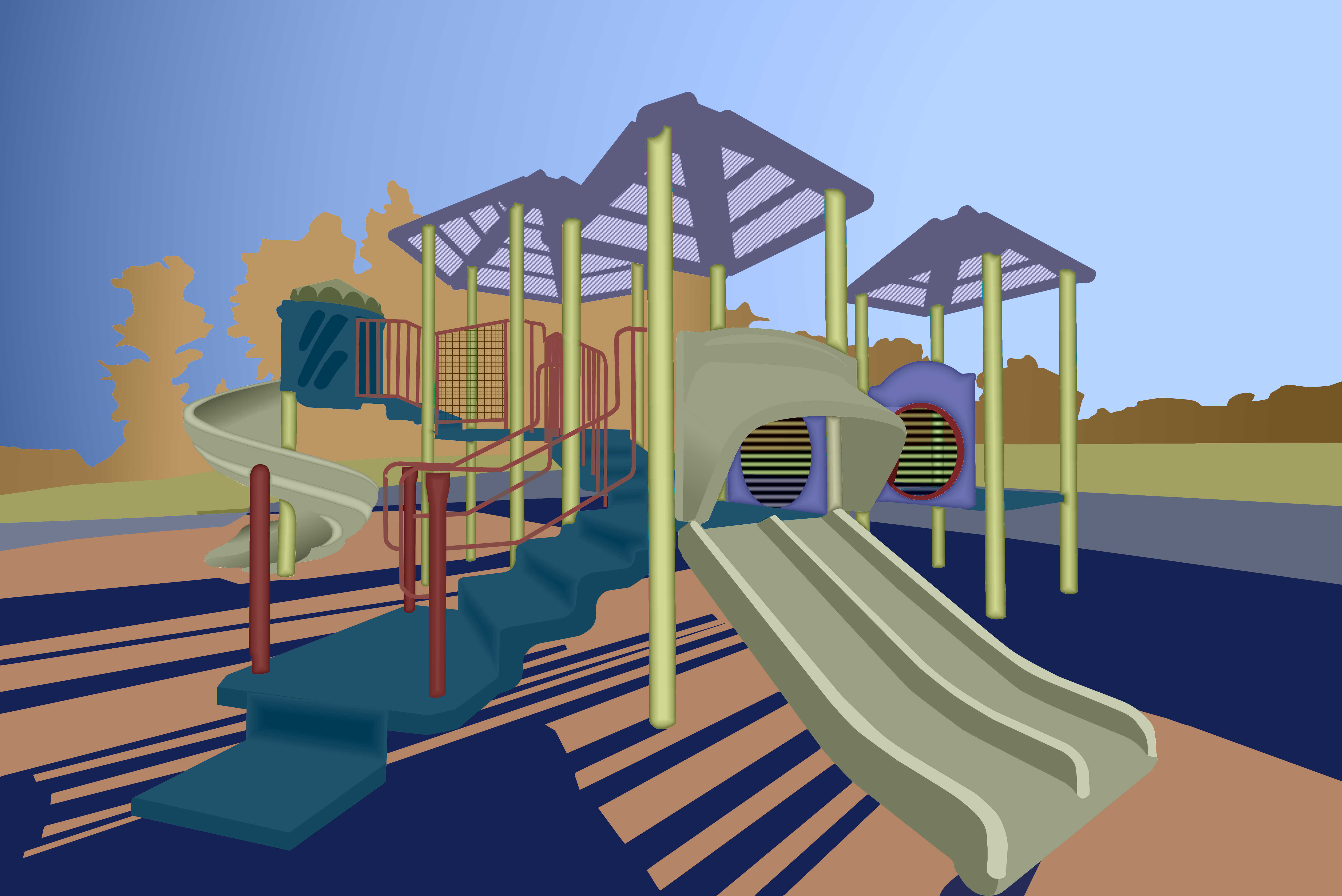 This is the final painting of the playground equipment. It has approximately the same colors as last week, but I changed them somewhat to match the gamut for a split compliment color scheme. I also made the trees golden to suggest fall, which describes the season outside now. The next slide shows the color gamut with the allowed hues.
I added more detail to break up the block shapes and provide a more inviting visual play for the viewer. My hope is that your eye will traverse the structure as a five year-old would explore the actual structure.
I deliberately left the sky and trees flat with no detail because I wanted the irregular edge of the tree tops to define the boundary between those two shapes. That provides a negative / positive interaction in the background.
The red pipe guardrails may be too busy, but without them the stairs seemed to float in space. This way they funnel the eye up to the pod above the spiral slide.
Another subtle eye path is the tunnel between the two elliptical openings on the mid-right. The red sickle shape helps drag the eye through that space. I made the background showing through the tunnel mesh darker and slightly bluer to suggest a somewhat confined tube.
I tried adding texture to some of the picture elements, but wound up liking the flat planes better. They are obviously abstractions and not trying to be too realistic. The roof panels have perforations, which makes those areas lighter.
The intensity or chroma is fairly modest, but any lower and the painting started to look drab. Maybe my eye was already conditioned to more saturation and I should have kept dialing it down. What do you think?
The shadows on the playground mat may compete with the play structure for your attention, but I wanted them to be very strong to suggest late afternoon light. The columns could have their highlights facing more toward the right where the Sun was, but I got lazy and used a default shaped gradient for all the columns at one time. Maybe the shadows are convincing enough without the more accurate modeling.
Sergei Bongart warns against getting too fussy with detail, and I might have transgressed that boundary. I wanted this to be a visual playground, though, so I had to keep pushing it towards realism until it firmly established itself. Someone with more experience might have been able to get the same effect with a much more abstract and schematic presentation.