I have never experienced color as music as Wassily Kandinsky did. I suspect it would take intense focus on both painting and music to achieve such synaesthesia. For me, I have to rely on symbolism and imagery to make that leap.
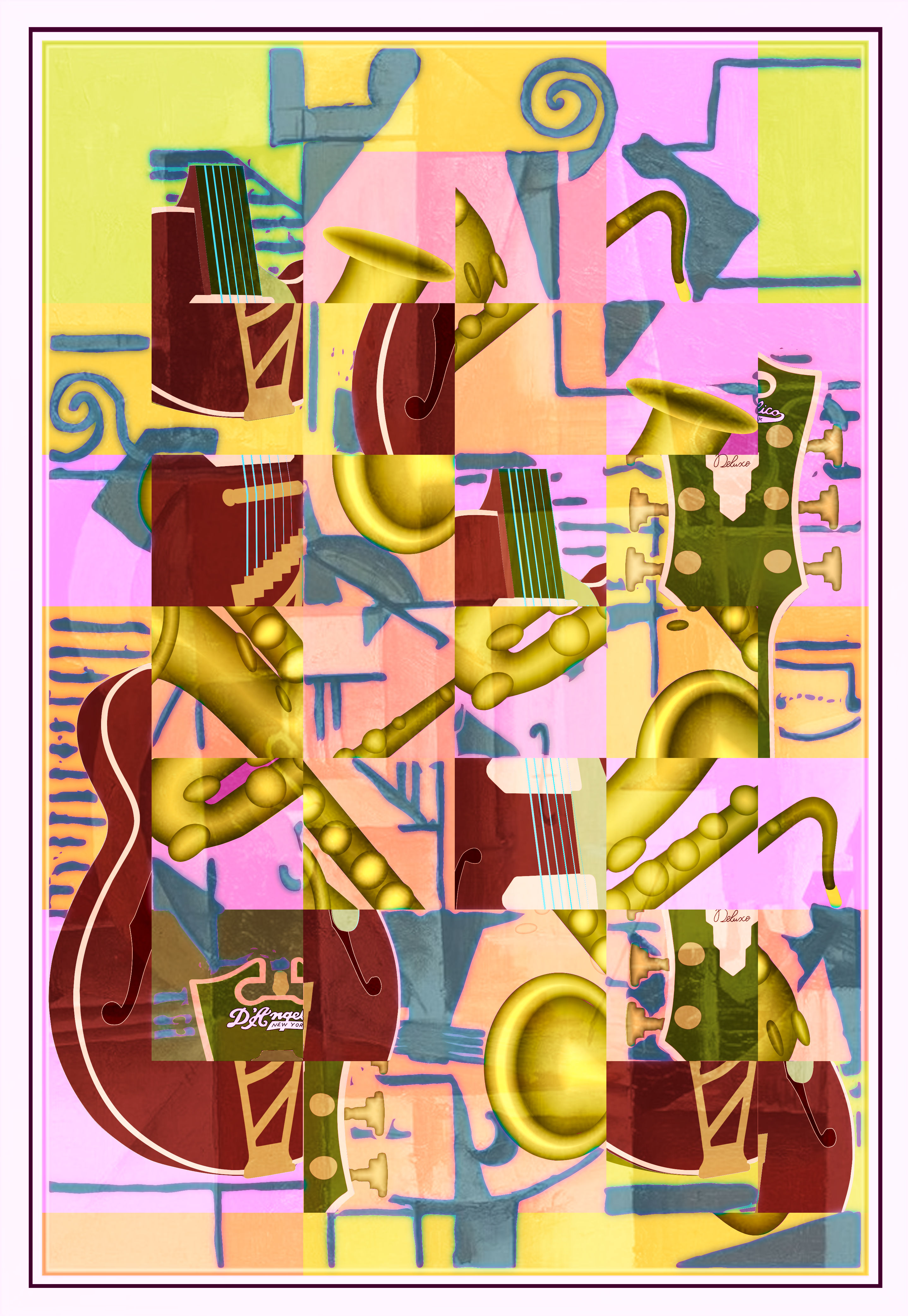
I wanted to somehow represent music, and also to experiment with color relationships. I wanted a non-representational painting to suggest the abstract nature of music and its ephemeral quality. I also wanted to portray rhythm and repetition of a theme.
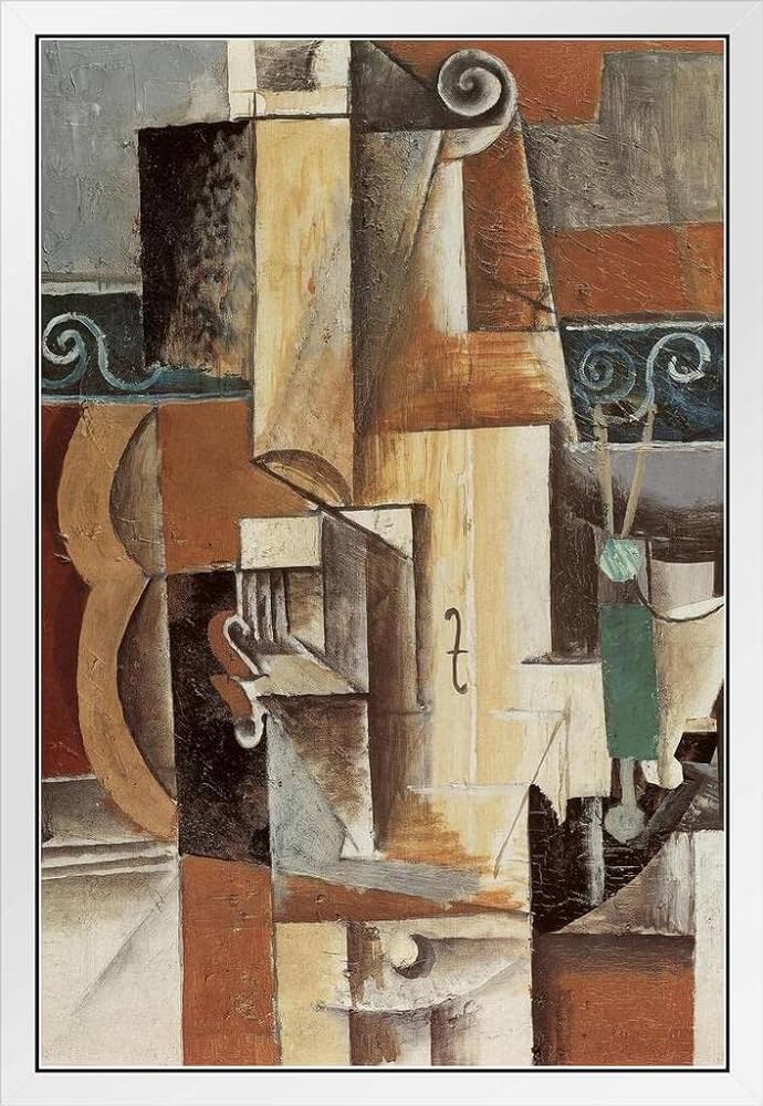
Kandinsky's use of color and abstract shape intrigues me, but his paintings intimidate me to some degree. Perhaps with time I will be able to approach that vision, but for now I will settle for something more accessible: cubism. Of course that leads me to Pablo Picasso. I used his painting Guitar and Violin for inspiration and guidance, shown on the next slide.
While angled planes appeal to me, it seemed my first effort in cubism might be facilitated with a cubic grid. Other artists have used this method of partitioning the canvas, including Piet Mondrian. That can open up possibilities for color and value contrast that representational forms might not provide. It will also allow repetition and juxtaposition of design fragments.
For this piece I used two photographs of my D'Angelico baritone guitar and two views of my Yanagisawa tenor saxophone. I positioned them on the canvas and then overlaid a square grid. I then chopped up the photos and rearranged the pieces. This was simple since the squares were identical in size.
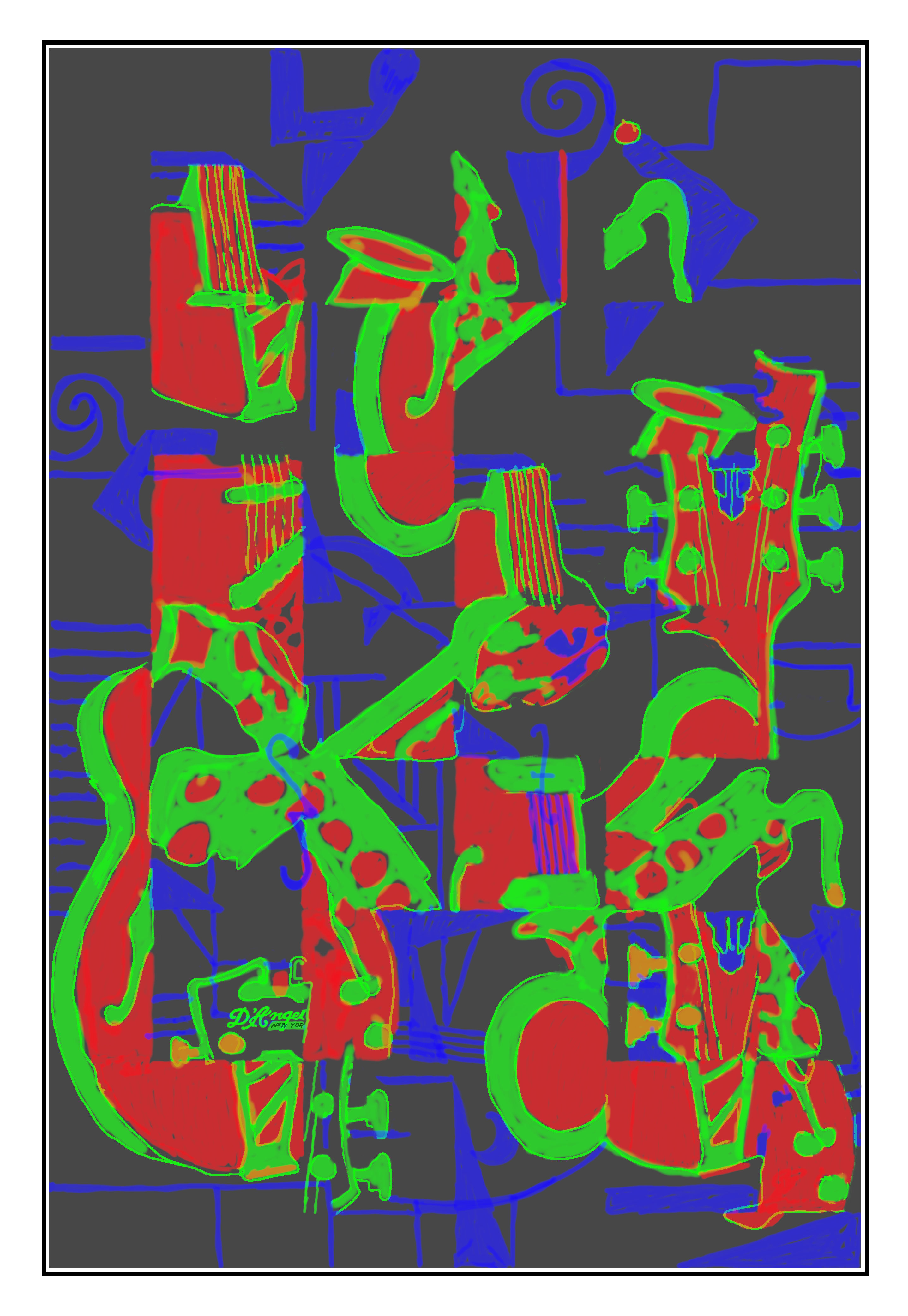
First I did a basic color study using red, green, and blue to determine continuity of shapes and dynamics of form. I did this freehand with my graphics tablet and stylus. Although this was rather crude, it provided a quick way to check the design without investing a lot of time on the drawing. The sketch is shown in the slide after Picasso's painting.
I used clues from the background of the brick wall behind the guitar and geometric shapes from Picasso's painting, which suggested some of the atonal and dissonant motifs in modern music, perhaps a la Arnold Shoenberg or Igor Stravinsky.
I then drew the forms I wanted with paths in GIMP and labeled them with the row and column numbers of the grid. From these paths I could then create the values, chroma, and hues in the LCH layer format.
The background colors vary with each square grid block, sometimes to set the form off via complementary colors, and sometimes to bind adjacent blocks together. They also act as superblocks that give the painting another level of design. They also present different color relationships for some of the repeated forms.
The symbols in blue represent ledger lines and perhaps clefs, sharps and flats, without being too literal. Some of these shapes were shamelessly borrowed from Picasso's painting. In fact, Picasso's painting exists as a ghost overlay, providing texture and shading in some forms and in the background.
One thing I learned from this attempt is that cubism and abstract art created by masters like Pablo Picasso, Wassily Kandinsky, and Piet Mondrian is hard to do. I think it would take a lot of practice and study to depart from representational form to the degree that these masters achieved, while still retaining profound meaning and pleasing visual (and perhaps auditory) experiences.